Land Cover Statistics by Country
Table of Contents
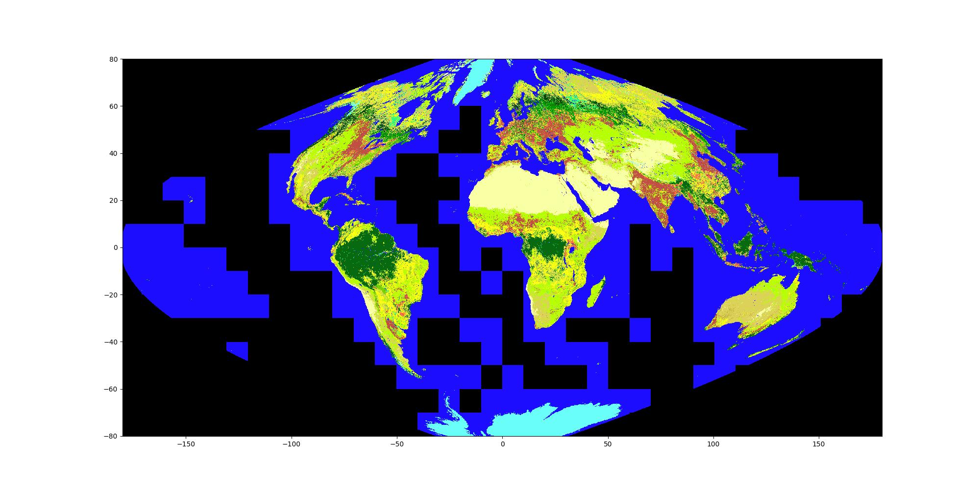
Figure 1: MODIS land cover data in its native sinusoidal grid. Longitude values apply only to the equator, with the exception of the Prime Meridian. The colours represent the Annual IGBP classification scheme, whose legend can be found in figure 3.
1. Introduction
Curious about deforestation and land use in general, I decided I should find out something about it. Of course it's easy to say that we should grow more trees, and more difficult to actually go and do so. Indeed, that got me thinking about land use in general. The World Bank's website contains some information (Group 2024) but the data is hardly credible; if it is to be believed, a full 60% of Australia's land was considered agricultural in 1990, and that fell from 59.3% to 48.7% between 2000 and 2014. This is hard to understand unless the giant outback cattle stations were considered agricultural land, then suddenly weren't. But including those stations would, I think, be stretching the definition of agricultural, unless we mean it in a purely legal sense. In fairness, on their website they do state that their data carries many limitations, based as it is on questionnaires and other information sourced from official national bodies, such that it becomes difficult to guarantee consistency from country to country, and across climatic zones.
So, seeing as I work with satellite data, I decided to find out what the land actually is, rather than what it is supposed to be, using satellite data. This was meant to be a simple exercise, but it quickly became clear just how rich questions of this nature are. I decided to use Google Earth Engine for this, as it provides all the tools to quickly produce the information I wanted, and it was a good exercise to get to grips with the sometimes unintuitive, though powerful, functional language its library is built around.
Here's a quick summary of some of the basic things I learned:
- Google Earth Engine is extremely powerful, and I have just scratched the surface of what it can do; it does have a steep learning curve, however.
- The satellite classification data provides some very interesting synthetic, numerical evidence of what our planet's land looks like and how it has changed over the last couple of decades.
- Purely in terms of square kilometres, without adjustment, from the start to the end of the period spanned by the MODIS data, Brazil's forests are declining fastest, followed by Canada's. Much of sub-Saharan Africa's forests are declining, cumulatively as much as Brazil's. China's forests, on the other hand, have increased vastly more than any other country's.
- Questions over land cover and land use are highly multidimensional.
2. Objective
The objective is pretty simple, I wanted to generate land cover statistics for every country using Google Earth Engine (GEE). But like most things with GEE, the simple things require a bit of work, with the complicated things (i.e. distributing a large number of processes and sub-processes across a large network of computers, each performing a part of any one of a series of pre-defined calculations, taking resolution and projection into account) being easy, sometimes to the point of stretching credulity.
The code here was inspired in large part by this article: https://spatialthoughts.com/2020/06/19/calculating-area-gee/. My initial attempt was just to calculate the statistics for one year, but in extending the capability of my code to calculate statistics for every year in the MODIS dataset, I managed to make numerous simplifications and improvements. If you are curious about the initial train-wreck of an attempt to produce the output for a single year, you can check it out here: https://code.earthengine.google.com/42ecc955c095fcdbd196dde022db1149; the final version, much improved after having learned my way around the API and the dataset structures, is here: https://code.earthengine.google.com/48298c686cd56649cf4b9aa7d15c5175.
The basic approach is to add up the areas for every pixel with the same land cover class within a country's borders. The areas are calculated using the pixelArea method. After having done this, a reducer can be applied—the sum reducer in our case. Almost incredibly, that's really it for the calculations. The rest is post-processing.
I won't go through every step here, as the code should speak for itself, but I've made a note of some aspects.
3. The Data
I wanted a global dataset for as long a period as possible, so I used the MODIS Land Cover Type (MCD12Q1) Version 6.1 (Friedl & D. 2022). The dataset covers a 23 year period, from 2001 to 2023, and although there exists a 30-year product from the ESA CCI project (conveniently available through the Copernicus Climate Change Service) it is not yet part of the GEE catalogue, so I'll defer using that to a later date. The country borders are provided by the geoBoundaries dataset (https://www.geoboundaries.org; see Runfola et al. (2020)).
One issue I found combining these two data sets is that the geoBoundaries borders do not always perfectly align with how bodies of water and land intersect. In places like New Orleans, for example, it appears that the boundaries include bits of ocean which end up being counted as water bodies in the land cover data. Any highly detailed study of water resources should really be done with a dedicated set of shapes for lakes and rivers.
While the land classification data surely has its own shortcomings (for a taste, see the article by Fagua & Ramsey (2019)), it solves a couple of problems that the World Bank data has. Firstly, it is one, objective metric for all countries, not relying on subjective measures and avoiding differences in interpretation of definitions. The land use is thus determined by what the satellite's instruments observe, and how the classification algorithm is defined, rather than what a government thinks, or wishes, its land is being used for. Naturally, the interpretation of each observation type as "water" or "forest", say, is not going to be completely fool proof, but it is at least consistent. This also means that land which is zoned agricultural but is in effect deciduous forest will show up as forest. The second advantage is resolution: the World Bank data is given on a country-by-country basis, but the satellite data is pixel-by-pixel, which means we can look at country subdivisions, or even just regions that we find interesting that don't correspond to political or administrative boundaries (e.g. the tropics, or the eastern United States).
This was an opportunity to put Google Earth Engine through its paces. I mean, sure, I could download the data, write some code in Python and xarray to mask off countries and calculate the areas, but why do all that when GEE can do the heavy lifting for you?
4. Preparation of the Dataset
The MODIS data is loaded as an ImageCollection with 23 features, one for each year, each containing 13 bands. The bands are for different classification standards, but since we are going to use the Annual IGBP scheme we can filter out the rest with select("LC_Type1"). Since we are going to calculate total areas for each land covert type, we must therefore also calculate the area per pixel, which we do using the ee.Image.pixelArea() function, together with the addBands method so that we can store this information in a separate band (which gets called "area"). This needs to be done for each feature (or image) in the collection.
5. The Reducer
In GEE parlance, a reducer "reduces" a stack of pixels to one value, such as a sum or average of some kind. For this problem, we seek the sum all pixels of each land cover type within a country's borders, which can be done with the method ee.Reducer.sum().
The reducer cannot be applied as is to the whole image collection. Instead, we need to evoke it using reduceRegions, selecting the reducer we want, i.e. ee.Reducer.sum(), and passing the necessary arguments. Because we are summing over different land cover types, we need to append the group() method and instruct it to do so with the groupField: 1 argument. This uses the 2nd band (band 1) to determine how to group the sums, performing the sum on all other bands, which in our case is just the area band (band 0). The result is a feature collection of feature collections which when flattened becomes a feature collection where each feature, one per country per year, contains a group of objects, each containing two numbers: the land cover type (which is named "class" in the code using the groupName argument to group()) and the corresponding sum.
Interestingly, the code and blog post by Ujaval Gandhi, which I found so useful in learning how to perform this sort of operation, uses the reduceRegion function, instead of reduceRegions. The difference seems to be mainly that with reduceRegion (singular) you have to explicitly map over each sub-region and the years. Compare
// Code excerpt Copyright (c) 2020 Ujaval Gandhi licensed under the terms of the MIT license.
// For a copy, see https://opensource.org/licenses/MIT
var calculateClassAreaByYear = function(year) {
  var startDate = ee.Date.fromYMD(year, 1, 1)
  var endDate = startDate.advance(1, 'year')
  var filtered = modisLandcover.filter(
    ee.Filter.date(startDate, endDate))

  var landcover = ee.Image(filtered.first())
  var classified = landcover.select('LC_Type1')

  // We write the map() function as before
  // But this time write it inline to make the code concise
  var districtAreas = kerala.map(function(feature) {

    var areas = ee.Image.pixelArea().addBands(classified)
      .reduceRegion({
        reducer: ee.Reducer.sum().group({
        groupField: 1,
        groupName: 'class',
      }),
      geometry: feature.geometry(),
      scale: 500,
      maxPixels: 1e10
      })
    var classAreas = ee.List(areas.get('groups'))
    var classAreaLists = classAreas.map(function(item) {
      var areaDict = ee.Dictionary(item)
      var classNumber = ee.Number(areaDict.get('class')).format()
      var area = ee.Number(areaDict.get('sum')).divide(1e6)//.round()
      return ee.List([classNumber, area])
    })
    var result = ee.Dictionary(classAreaLists.flatten())
    // The result dictionary has area for all the classes
    // We add the district name to the dictionary and create a feature

    // New! We need to now add the year in the property so we
    // can identify which year did this calculation came from
    // Convert year to a string which looks better when we export.
    var district = feature.get('ADM2_NAME')
    return ee.Feature(feature.geometry(),
      result.set('district', district)
        .set('year', ee.Number(year).format('%d')))
  })
  return districtAreas
}

// Now create a list of years and map() the above function
var years = ee.List.sequence(2001, 2018)

var results = years.map(calculateClassAreaByYear)
with
var redreg = function(image){
  var areas = image.reduceRegions({
      reducer: ee.Reducer.sum().group({
      groupField: 1,
      groupName: 'class',
    }),
    collection: geolabFiltered,
    scale: 500,
  })
  return areas
}
var areas = lcmode.map(redreg)
Now a lot of the original code consists of housekeeping operations which I defer to later—things like recording the date, and putting the class and sum object pairs into a dictionary. But I don't have to explicitly map over sub-regions, nor over years. This is all managed care by reduceRegions. And while the housekeeping is not insignificant (indeed, the code is of similar length, if not longer), it does seem semantically preferable to keep it as separate as possible from the calculation, which is what reduceRegions (plural) enables you to do. My "housekeeping" step then is fully separated from the calculations; it consists of this block of code,
// get system:index (for the date) and set as a feature property
var index_date = function(el){
  var dateind = ee.String(el.get("system:index"))
  var setdate = function(fe){
    return fe.set({"year": dateind.slice(0,4)}).setGeometry(null)
  }
  return ee.FeatureCollection(el).map(setdate)
}
areas = areas.map(index_date)
areas = areas.flatten()

// Convert class, sum pairs into a dictionary and append to
// feature dictionaries for output into csv columns
var xformgroups = function(feature) {
  // function to extract "groups" list (list of class, sum pairs)
  // from feature
  var groups = ee.List(ee.Feature(feature).get("groups"))
  var obj2arr = function(obj){
    var obj = ee.Dictionary(obj)
    var classn = obj.get("class")
    var sum = obj.get("sum")
    return ee.List([classn, sum])
  }
  var sums = groups.map(obj2arr).unzip()  // for arrays we would use transpose
  var classarr = ee.List(sums.get(0))
  var sumarr = ee.List(sums.get(1))
  var tostring = function(num){
    // function to convert numbers to strings
    var number = ee.Number(num).int()
    return ee.String(number)
  }
  classarr = classarr.map(tostring) // convert classes to strings
  // convert to dictionary
  var sumdict = ee.Dictionary.fromLists(classarr, sumarr)
  return feature.set(sumdict).set({"groups": null})
}
areas = areas.map(xformgroups)
The result is a nice table which can easily be exported to CSV, and which can be loaded with, e.g., Pandas in Python for some more exploration and post-processing (I've truncated the table to the first three classes; missing values are blank).
| shapeGroup | shapeName | shapeType | year | 1 | 2 | 3 |
|---|---|---|---|---|---|---|
| IRQ | Iraq | ADM0 | 2001 | |||
| IRL | Ireland | ADM0 | 2001 | 3.16473171407598E8 | 1.7158471217681983E9 | 846338.6334558823 |
| KAZ | Kazakhstan | ADM0 | 2001 | 8.881275290897058E8 | 2.173126714900735E8 | |
| KEN | Kenya | ADM0 | 2001 | 1961729.1311887256 | 7.524707833740321E9 | |
| PRK | Korea, North | ADM0 | 2001 | 7.721856846764705E7 | 2.5397962426899504E7 | |
| KOR | Korea, South | ADM0 | 2001 | 5.074722096298407E8 | 4.371337934283088E7 | 1.8558311718688726E7 |
| XKX | Kosovo | ADM0 | 2001 | 2.872034058529412E7 | 48761.525 |
6. Mapping
Not cartography but function mapping. Having used Fortran extensively for two decades now (it is still the language of choice for large, operational geophysical models where speed is paramount, such as atmospheric and ocean forecasting models), the functional approach to repeating an operation on a collection of elements of a given type (i.e. loops in an imperative language) was unfamiliar, and I found it kind of fun, so I have documented it here.
The functional language of GEE confused me a little to begin with, mainly because the structure of the feature collections was not obvious to me—there are dictionaries, lists, "objects" (which can be anything), properties, and columns. Having worked extensively with NetCDF and xarray, and a fair bit with Pandas as well, this all seemed rather chaotic and strange to me. There are specific functions to get values from specific data objects, and it often took me a while to work out which one I wanted. But more to the point, I carried with me an expectation that all the labelling and organising of results into usable and exportable objects (arrays and tables, with the correct metadata in place) would be taken care of for me. So the big paradigm shift was really understanding that you have to do this manually a lot of the time, and that's where your effort needs to go. Once I understood that, I then needed to see how to think in terms of mappings rather than loops to effect the changes I wanted.
This explains the big difference between my first attempt, which only produced the table for a given year, and the second attempt, which I describe in this document, where all years are used. Having to work out how to adapt the code to map over years forced me to reconsider my choices, and apply what I had learned about using GEE during my first attempt in a much more effective way. When starting I took ThePrimeTime's advice which was to avoid copying the "ideal" solution that I had googled, and to try to figure out as much as I could myself, producing suboptimal code but learning far more than if I had simply copied and adapted the model solution. In doing that, as shown above in section 5, I also appear to have found an optimisation not present in the code I used as a model. And once I'd realised that the transformations I wanted to effect could not be simplified any further, the mapping ended up being relatively easy: instead of nested loops, there are nested mappings.
To see how a nested mapping works, consider an excerpt from my code above,
var index_date = function(el){
  var dateind = ee.String(el.get("system:index"))
  var setdate = function(fe){
    return fe.set({"year": dateind.slice(0,4)}).setGeometry(null)
  }
  return ee.FeatureCollection(el).map(setdate)
}
areas = areas.map(index_date)
In plain English, if we ignore the precise functionality of each function, this can be summed up as
Run the function
index_dateon every feature collectionelcontained within the feature collection of feature collectionsareas, and for each feature collectionelrun the functionsetdateon every featurefeofel.
In detail, if we work from the inside out, consider first the code block that begins with var setdate = function(fe). This defines a function I have named setdate which takes as input a feature or an image, which we generically label fe. (In GEE "features" and "images" are the two main object types. Though they are different, they are often interchangeable, with many of the same functions and methods working for either.) The function runs a chain of methods on the feature fe—being the set and setGeometry methods—and returns the result, being an updated version of the same feature. These methods simply add a date string to the feature, and remove the geometry information which is no longer needed, as we have calculated our statistics. The result is a feature corresponding to one country determined by the shapeGroup property, and one year, now labelled in the year property. To summarise very simply, the function takes a feature fe as input and returns a feature.
Now look at the line beginning with var index_date. This is a another function which operates this time on a feature collection el, and it contains within it the function setdate I described in the previous paragraph. Feature collections and image collections are containers usually consisting of, respectively, features and images, but they can also be collections of other feature collections. This is the case here: when we applied the reducer using reduceRegions, we created a feature collection of feature collections called areas. Each one of these inner feature collections contained within areas corresponds to the MODIS data for a given year, and that year is recorded in the system:index property of that year's feature collection. I fed this property to the setdate function to add a date string to each feature contained within the inner feature collection.
So to recap, the outer function operates on a feature collection, getting a date, then launching a function which operates on each feature in that feature collection. In terms of the actual operations, we are getting the date string for a given year, then appending that date string to each country's dataset for that year.
In an imperative paradigm, what I have just described would be akin to looping over years, then looping over countries. The way this translates in GEE's functional approach, translated into Javascript methods, is to call the map method on an object (which can be a feature or feature collection) with the desired function as an argument. So we "map" the function index_date onto each feature collection el of the feature collection areas, which results in a new feature collection of modified feature collections. And for each feature collection el that index_date is operating on, we map setdate onto the features fe of the feature collection el, which results in a modification of those features.
I have probably made this sound more complicated than it is.
7. Results
7.1. Mapped Land Cover for Australia
Well this is all well and good, but what did we learn? Before we get to the results calculated using the code above, let's take a few seconds to appreciate what this data actually looks like on a map. For example, this map of Australia,
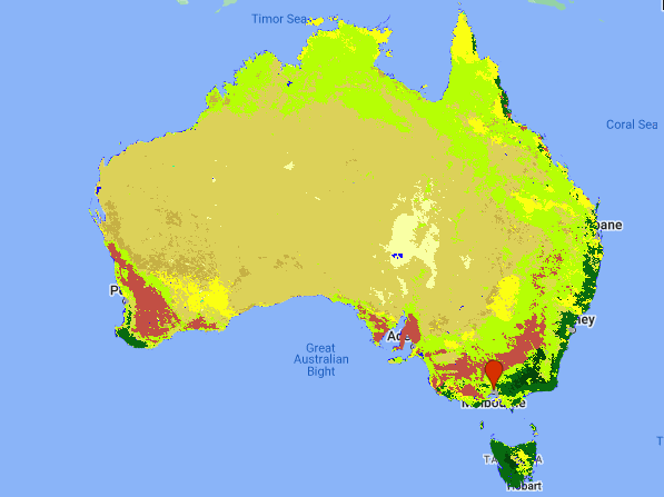
Figure 2: MODIS land cover for Australia in 2021. For the legend see figure 3.
Australia is a big country in terms of land mass, but not so big in terms of population; this map provides one reason why that might be: it's mostly dry and inhospitable. In all honesty though, I am even surprised to find that most of it is classified as "open shrubland". Indeed, a quick perusal of the satellite images shows that indeed, there is some vegetation throughout most of the dry continent, and though it is sparse, the Sahara it is not.
Another feature which stood out to me, which won't be news to anyone who pays attention, is just how extensive the cropland in Western Australia is—about the size of the state of Victoria! Zooming into the satellite images on Google Earth will show that the patchwork quilt of fields seems endless. Anyone who has read A. B. Facey's "A Fortunate Life" will have an inkling about how that land was opened up and settled by white Australians at the turn of last century, and how isolated those early farmers were. I won't include pictures here, you should really scroll through the satellite imagery yourself on Google Maps, Earth or similar (or GEE, why not!), it is something to behold.
Looking at the map also provides an opportunity to revisit the question of how land is classified. I have not attempted to trawl through the World Bank's sources to check their classification method, but it is nevertheless telling that Australia's largest cattle station, Anna Creek Station in South Australia, just to the west of Lake Eyre (easily located as the large blue spots north of Adelaide), is very clearly in what is classified as open shrubland—its use may be agricultural, but the land is nothing like what we might think of as farm land and is probably quite close to its natural state. In a similar vein, the grasslands which make up the biggest category after open shrubland are also clearly used for pasture in many places, such as in Victoria and New South Wales. Though things get complicated in the Northern Territory where the "grasslands" sometimes look more like shrubland, yet they are classified the same as the New South Wales grasslands. Of course, looking at two-dimensional, relatively low-resolution satellite images from an unknown date does not tell the full story either. For a more serious study we would have to retreive images recorded throughout the year corresponding to the MODIS data, and also pay close attention to the specific methods used in the classification algorithm.
7.2. Time Series
Given the widely reported deforestation which is ongoing in Brazil, apparently to develop beef farming, let's have a look at time series of its forest cover,
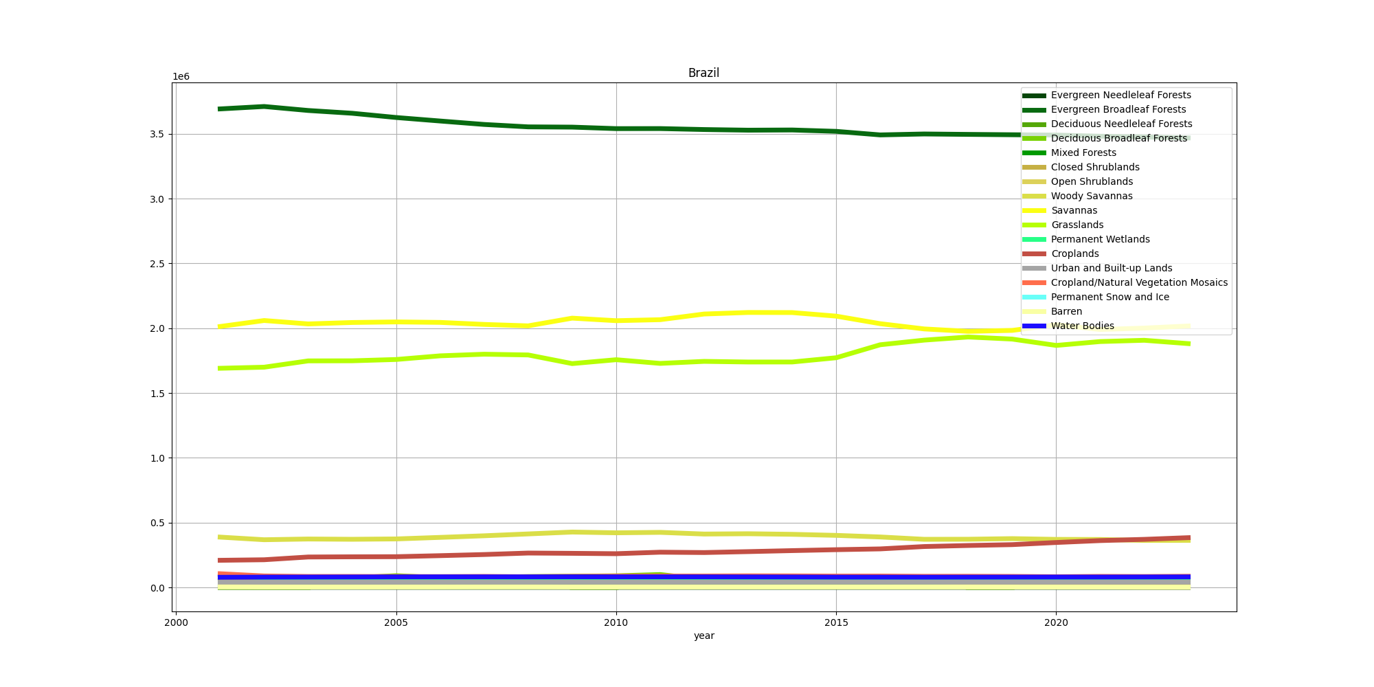
Figure 3: MODIS land cover for Brazil, time series from 2001 to 2023. Values are shown as a percentage of total surface area.
From this graph we can see the decline in "evergreen broadleaf forests" (the classification is defined by the International Geosphere-Biosphere Programme (IGBP); see Sulla-Menashe et al. (2018)). This is offset by the increase in croplands and grasslands, more or less what we would expect to see.
When it comes to debates over addressing climate change, biodiversity and deforestation, we do tend to pick on Brazil a lot. Is this justified? I decided to look at the numbers, combining all forest types together. We get this:
| Country | Change in forest coverage (sq km) |
|---|---|
| Brazil | -243315 |
| Canada | -121407 |
| Congo, Dem Rep of the | -75822 |
| Indonesia | -55757 |
| Mozambique | -42918 |
| Mexico | 28594 |
| Russia | 38334 |
| Central African Rep | 41690 |
| India | 64624 |
| China | 306427 |
So to answer the question simply, based only on these numbers, yes… however it is surprising that Brazil gets mentioned on a regular basis while Canada is rarely mentioned, and yet its deforestation is very nearly half that of Brazil's, which is an enormous amount, and its population is about one fifth that of Brazil, and wealthier. Of course not all forests are alike, and neither have I controlled for suitable land area, nor population, nor economy, nor biodiversity, nor what the forest is being replaced with (low quality beef farming is probably one of the least beneficial things to cut the Amazon down for, especially when compared with replanting, say, for logging). With that said, let's have a look at a time series for Canada.
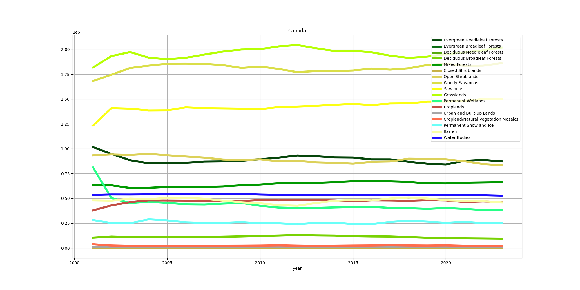
Figure 4: MODIS land cover for Canada, time series from 2001 to 2023, in square kilometres.
Interestingly, deciduous needleleaf forests have increased in surface are, but evergreen needleleaf forests have fluctuated greatly, never recovering from the rapid decrease prior to 2005. The decrease seems to be compensated by the increases in woody savannas (30–60% tree cover), savannas (10–30% tree cover) and grasslands. The savannas in particular display not only a steep increase prior to 2002, but a fairly steady increase thereafter. It looks as though there is an interesting interplay between the grasslands, woddy savannas and evergreen needleleaf forests, whereby the woody savannas decrease while the grasslands and forests increase. It's not possible to be certain based on this data, but a plausible hypothesis is that some of the woody savanna is replanted, while some of it undergoes a further transformation to grassland. It's also noteworthy that a big expansion of cropland took place in the period of steep deforestation prior to 2005. We can see where this occured by looking at the map for 2001 and comparing it with that for 2023.
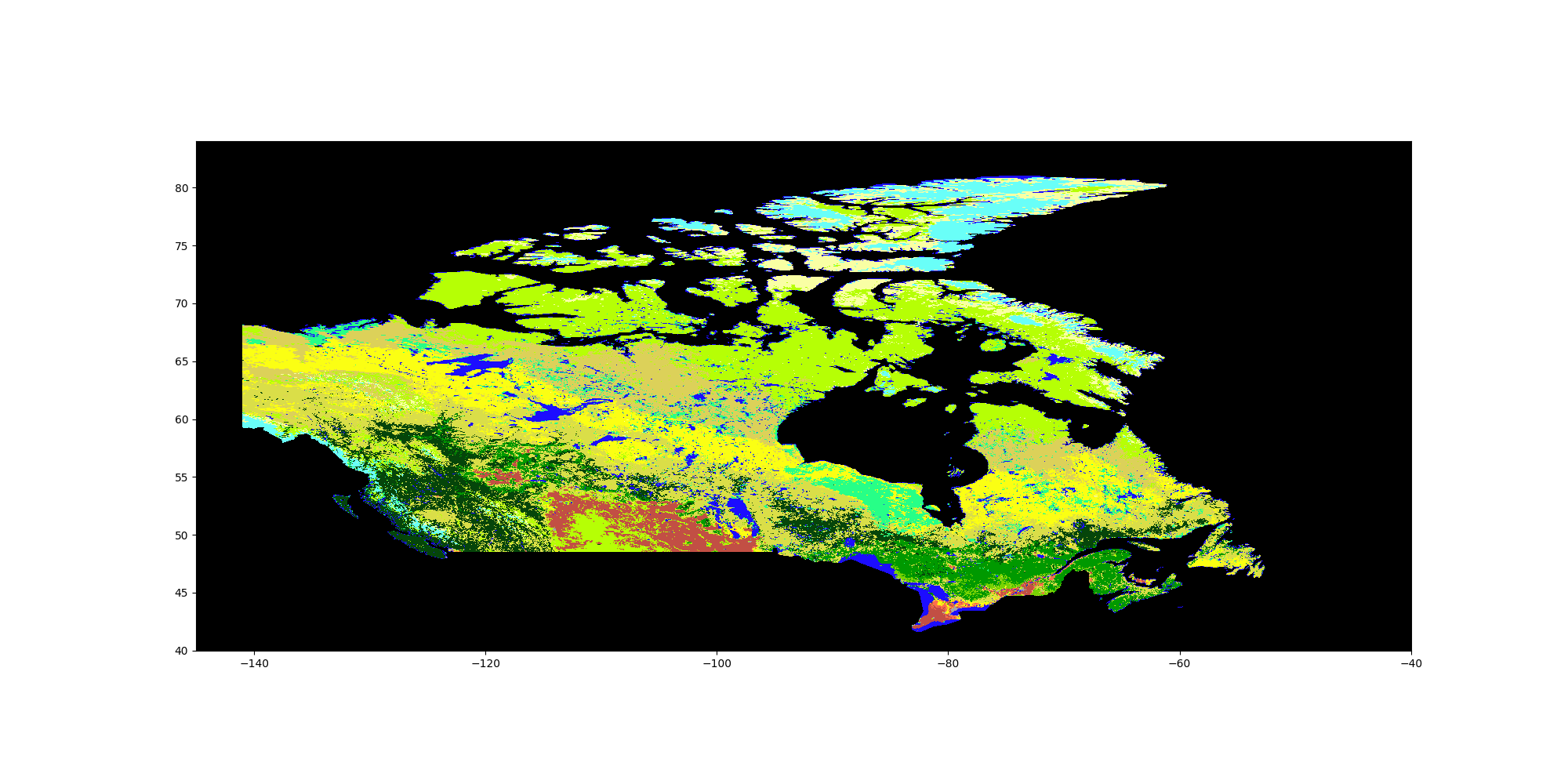
Figure 5: MODIS land cover for Canada, 2001, reprojected. For legend see figure 4.
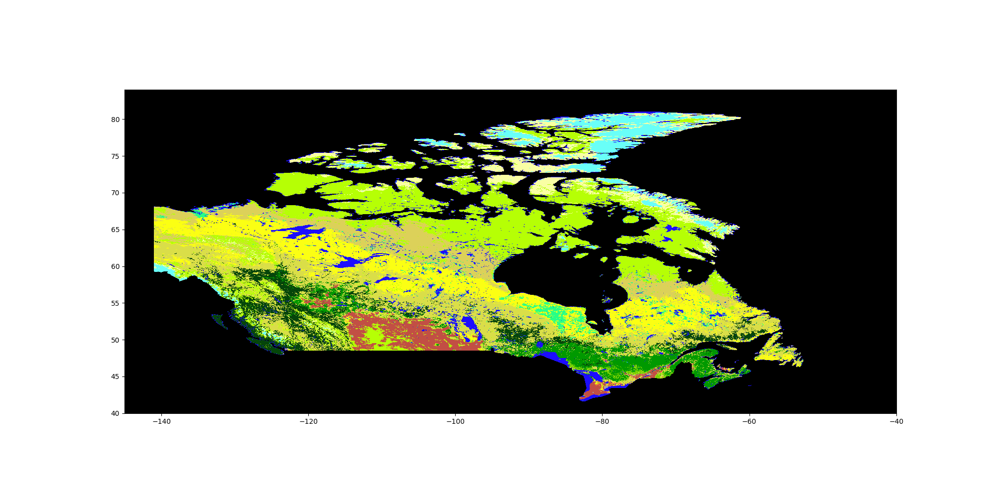
Figure 6: MODIS land cover for Canada, 2023, reprojected. For legend see figure 4.
Consulting the map, increase in cropland appears to be mostly from converted grassland, and not directly from cutting down forests. Meanwhile, the steep decline in wetlands looks like it is mostly compensated by conversion to savannas. As this example makes clear, the multidimensional nature of this dynamic landscape makes attribution complicated without looking at the maps.
A host of countries in sub-Saharan Africa have also suffered big losses in forest cover: the Democratic Republic of the Congo, Angola, Tanzania, Mozambique, Ivory Coast and Madagascar are in the top 15 for greatest absolute loss of forest cover, making up a total of 215005 square kilometres lost. That's getting close to Brazil's loss, for a comparable surface area in the tropics. But also interesting is that China has apparently grown its forest cover by more than what Brazil has lost. China is immense, but so are a few other countries, such as the immensely wealthy United States (a loss of 4915 square kilometres of forest cover) and Australia (a small increase of only 9451 square kilometres; in fairness, Australia's population is small for its size, and most of its land is, as we have seen, pretty inhospitable and very dry and prone to bushfires, so it's not immediately clear what a good number would be). And there are still more questions, such as the types of trees being planted: are they being planted as a monoculture? Are they for forestry or for regeneration? Are they the right type for the climate and ecosystem? This is a deep subject, though spending some time with satellite images and correlating them to the MODIS data would shed light on these questions.
The case of Canada has been evoked before, as well as alternatives to simply demanding that Brazil do what the West wants without a quid pro quo. This is not a political essay, nor a scholarly article about forest management or remote sensing, so I won't go further, and I'll leave it to the reader to investigate whether or not these are reasonable claims, and what other solutions might be viable.
A word of caution to wrap up: there is no guarantee that these trends are accurate in every case. Zhang et al. (2017) showed that some trends could be explained by instrument degradatation, and while one would hope that more recent reprocessing of MODIS data would correct for this, it is a reminder that one should tread with caution when drawing conclusions from this data, and understand more fully what it really is that one is looking at. In particular, while here I have taken the time series at face value, I did note when looking at time series for a number of different countries that many of them showed steep gradients of increase or decrease for certain land classes in the period before 2005, much like what we saw with Canada. This could be a problem with how the data is gathered or processed, but it also could be a genuine reflection of other trends, either climatic, economic or political. It would be interesting to see if the other classification schemes reflect these trends, and indeed whether they are visible in the Copernicus data.
8. To do
I did find these simple—indeed, simplistic—calculations a useful exercise, thought provoking, and a taste of what can be done using GEE. But so much more could be done, and I've half a mind to do it. A good start would be what I haven't done and dive more deeply into the scholarly literature. Of course, as they say, a little knowledge is a dangerous thing, so caution and humility are of the utmost importance.
More concretely, and simply, there is a lot I haven't explored in GEE yet, which could help refine the results. Trying out the different land classification schemes is the first and most obvious, but also uploading my own data (the aforementioned Copernicus land cover data) to lengthen the time series is on the agenda. Indeed, I haven't really explored the time series in detail, nor have I looked at all land classes. What would be particularly interesting, however, is to use GEE's built-in machine learning tools to develop my own land classification scheme. The only problem will be validation, so it might not be generally useful, but it could be instructive to try this (I have done so as a simplified exercise, so it would be interesting to extend that). For all this and more, stay tuned.